
No products in the cart.
Business Online, SEO, Website Design
5 Common Website Mistakes Small Businesses Make
SMALL BUSINESS WEBSITE GUIDE
5 Common Website Mistakes Small Businesses Make (and How to Fix Them)
A small-business website can look polished and still quietly make it harder for visitors to understand the business, trust it, find it in search, or take the next step.
The most common problems are usually fixable: unclear messaging, weak conversion paths, missing proof, poor mobile or performance experiences, and weak SEO foundations.
Updated for 2026
THE QUICK ANSWER
What are the most common small-business website mistakes?
The biggest website problems are rarely one dramatic failure. They are usually smaller issues that compound: visitors cannot quickly understand the offer, the next step is unclear, there is not enough proof to build confidence, the mobile experience is frustrating, or search engines cannot easily understand the site.
A useful website should help the right visitor answer four questions quickly: What does this business do? Is it right for me? Can I trust it? What should I do next?
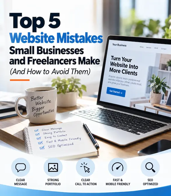
The 5 mistakes at a glance
1. Unclear message or audience
2. Weak calls to action and contact paths
3. Too little proof or credibility
4. Slow or frustrating mobile experience
5. Weak SEO and search visibility foundations
MISTAKE 1
Your message is too vague or tries to speak to everyone
A visitor should not have to study your homepage to work out what your business does. This is especially important for service businesses and freelancers, where the website often needs to explain an offer that is less obvious than a physical product.
Above the fold, aim to communicate what you offer, who it is for, and the practical outcome. Avoid broad claims such as “quality solutions” or “we help businesses succeed” unless the surrounding copy explains exactly what that means.
If the site’s copy has grown piecemeal over time, the problem may be messaging rather than design. The guide on website copywriting that connects goes deeper into headlines, value propositions, and page-level messaging.
HOW TO FIX IT
Make the first screen answer three questions
✓ What do you offer?
✓ Who is it for?
✓ What should the visitor do next?
Practical test: Show the first screen to someone unfamiliar with the business for five seconds. Can they explain what the business does afterward?
HOW TO FIX IT
Build a clear path to the next step
✓ Choose one primary CTA for each page
✓ Use specific button language
✓ Repeat the CTA where it is useful
✓ Keep the Contact page easy to find
✓ Test forms on desktop and mobile
✓ Make phone and email links clickable
MISTAKE 2
Visitors do not know what to do next
A website can explain the business well and still underperform if there is no obvious next step. Calls to action should guide visitors rather than make them guess.
The strongest CTA depends on the page and business. It might be Request a Quote, Schedule an Appointment, View Services, See the Portfolio, or Contact Us. The important part is that the action is relevant and easy to understand.
Do not make every button compete equally. A primary action should be visually clear, while secondary links can support visitors who are not ready to contact you yet.
For LaunchPad projects, this is why service pages, portfolio case studies, pricing, and the contact path are intentionally connected rather than treated as isolated pages.
MISTAKE 3
Your website asks for trust without showing enough proof
Prospective customers often arrive knowing very little about the business. Claims such as “experienced,” “trusted,” or “high quality” are more persuasive when the website also shows evidence.
For freelancers, that may mean a strong portfolio. For service businesses, it may mean reviews, project examples, credentials, before-and-after work, client stories, or clear information about the person behind the business.
REVIEWS & TESTIMONIALS
Use specific, authentic feedback
Strong testimonials explain what the client needed, what changed, or why they valued the experience. Avoid anonymous praise when you have permission to provide better context.
PORTFOLIO & CASE STUDIES
Show the work in context
Do more than display screenshots. Explain the challenge, strategy, solution, and business purpose. See how LaunchPad uses client transformation stories as proof.
REAL BUSINESS DETAILS
Make the business feel tangible
Use clear contact information, an About page, real team or owner information, service details, and appropriate third-party profiles or credentials.
MISTAKE 4
The mobile experience is slow, cramped, or difficult to use
Mobile usability is not an optional extra. Google primarily uses the mobile version of a page for indexing and ranking, and responsive design is generally the most maintainable way to provide the same content and functionality across devices.
A responsive layout alone is not enough. Buttons still need to be easy to tap, forms need to be practical on a phone, text needs to be readable, and important content should not disappear or become harder to access on smaller screens.
Performance matters too. Google’s Core Web Vitals guidance defines “good” performance as an LCP of 2.5 seconds or less, INP of 200 milliseconds or less, and CLS of 0.1 or less at the 75th percentile.
Use Google PageSpeed Insights as a diagnostic tool, but do not chase a perfect score at the expense of useful content, accessibility, or design.
Quick mobile and performance check
✓ Test the homepage and key service pages on a real phone
✓ Check navigation with one hand
✓ Submit every important form on mobile
✓ Compress oversized images
✓ Remove unnecessary scripts and plugins
✓ Check PageSpeed Insights and Core Web Vitals
✓ Watch for layout shifts while the page loads
HOW TO FIX IT
Start with useful SEO foundations
✓ Give each important page a clear purpose
✓ Use descriptive page titles and headings
✓ Write for the questions customers actually ask
✓ Add useful internal links in context
✓ Use descriptive image alt text
✓ Keep important pages crawlable and indexable
✓ Monitor Search Console instead of guessing
MISTAKE 5
The website has no clear search visibility strategy
A website does not become search-friendly simply because a few keywords were added to the homepage. Search visibility depends on clear page intent, useful content, crawlable site structure, descriptive titles and headings, internal linking, technical accessibility, and authority over time.
Contextual internal links to important pages help visitors and search engines understand how the site’s content fits together. Your service pages, portfolio, pricing, guides, and related resources should support one another naturally rather than exist as disconnected pages.
If you want a deeper starting point, read the WordPress SEO Guide, explore LaunchPad’s WordPress SEO services, or run the free WordPress SEO audit.
WHY THESE MISTAKES MATTER
Each mistake interrupts a different part of the customer journey
CLARITY
Unclear message
Visitors cannot quickly tell whether the business is relevant to them.
ACTION
Weak conversion path
Interested visitors are not shown a clear, appropriate next step.
TRUST
Missing proof
The website makes claims but gives visitors too little evidence to evaluate them.
EXPERIENCE
Poor mobile or performance experience
The site is harder to read, use, or interact with—especially on the devices Google primarily uses for indexing.
DISCOVERY
Weak SEO foundations
Search engines and prospective customers have a harder time finding and understanding important pages.
15-MINUTE WEBSITE CHECK
A simple action plan for improving your website
You do not need to redesign the entire website because one area needs work. Start by identifying the weakest point in the visitor journey and improve that first.
If your website is older or the problems run deeper than individual fixes, the guide on signs it may be time for a website redesign can help you decide whether incremental improvements are enough.
□ Can a new visitor understand what you do in a few seconds?
□ Is the primary next step obvious?
□ Does every important page have a useful CTA?
□ Are reviews, case studies, or project examples easy to find?
□ Can you use navigation and forms comfortably on a phone?
□ Are important pages fast and visually stable?
□ Does each important page target a distinct topic or intent?
□ Do related pages link to one another naturally?
□ Are your contact details current and easy to use?
□ Does the website still reflect the business you operate today?
FIX THE RIGHT PROBLEM
Does your website need a few improvements—or a full redesign?
A focused fix can be enough when the structure is sound and the issue is limited to messaging, calls to action, proof, performance, or SEO.
A broader redesign may make more sense when the site no longer represents the business, the navigation and page structure are fundamentally confusing, mobile problems affect most of the site, important functionality is unreliable, or fixing the existing design would require repeated workarounds.
COMMON QUESTIONS
Small-business website mistakes FAQs
Quick answers about website messaging, mobile usability, speed, SEO, calls to action, and when a redesign may be appropriate.
What is the biggest mistake small businesses make on their websites?
One of the most damaging mistakes is failing to make the business and next step clear. A visitor should quickly understand what the business offers, who it helps, why it is credible, and what action to take next.
How do I know if my website messaging is unclear?
Ask someone unfamiliar with the business to look at the first screen of the homepage briefly and explain what the company does, who it serves, and what they would do next. If they cannot answer easily, the messaging or hierarchy likely needs work.
Does every page need a call to action?
Most important pages should provide a useful next step, but the action does not have to be the same everywhere. A service page may invite a quote request, while a case study may lead to related work or a contact conversation.
How important is mobile design for a small-business website?
Mobile design is essential for usability and search visibility. Google primarily uses the mobile version of a site’s content for indexing and ranking, so important content, links, forms, and navigation should work well on smaller screens.
What website speed should I aim for?
There is no single page-load number that determines whether a website is good, but Google’s Core Web Vitals guidance defines good LCP as 2.5 seconds or less, INP as 200 milliseconds or less, and CLS as 0.1 or less at the 75th percentile. Use those metrics alongside real usability and business needs.
Can poor SEO be fixed without redesigning the whole website?
Often, yes. Titles, headings, internal links, page intent, content quality, technical accessibility, and metadata can frequently be improved without rebuilding the entire site. A redesign becomes more relevant when the underlying structure, usability, or technology is also creating problems.
Should I add testimonials or a portfolio to my website?
If they are relevant to the business and authentic, reviews, testimonials, portfolio examples, and case studies can help prospective customers evaluate credibility and understand the kind of work or experience they can expect.
When is it better to redesign instead of fixing individual problems?
A redesign may be more efficient when the site no longer reflects the business, the structure is fundamentally confusing, mobile issues affect most pages, important functionality is unreliable, or solving individual problems would require repeated workarounds.
KEEP IMPROVING YOUR WEBSITE
Related LaunchPad website guides
MESSAGING
Website Copywriting That Connects
Improve headlines, value propositions, page messaging, and calls to action.
PERFORMANCE
Why Website Speed Matters
Understand website performance, Core Web Vitals, and practical ways to improve speed.
PLANNING
Building Your First Business Website
Plan pages, content, structure, design, SEO, testing, and launch in a logical order.
REDESIGN
7 Signs It’s Time for a Website Redesign
Decide whether targeted improvements are enough or a broader redesign makes more sense.
REAL WORK
LaunchPad Client Success Stories
See how strategy, messaging, design, SEO structure, and user experience come together in real projects.
MAKE YOUR WEBSITE WORK HARDER
Not sure which website problems are worth fixing first?
LaunchPad works directly with small businesses on WordPress strategy, design, redesign, SEO, and ongoing Website Care. Tell me what is not working, and I will give you a practical recommendation based on the website and your business goals.
